No matter what you do, project wise, we can all agree that fonts matter. We’ve been talking in our office lately about some of the most insane design fails we’ve seen simply because the font was illegible, unsuitable for the situation, or poorly executed. In talking about this, we also started to realize that some people may not realize why these decisions don’t work. We thought we’d illustrate our thoughts on this with a few examples. Are they necessary? Maybe not. Do we think everyone needs to see them? Definitely.
 One thing we’ve all likely seen float around social media (especially if you have friends in design or art) is the meme showing why fonts matter in a message. The image shows the phrase “You’ll always be mine…” in a romantic handwritten font and then in what looks like a font associated with a horror movie. With this message, fonts truly do matter.
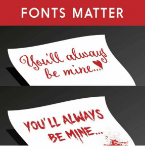
 However, there are real-world instances of spectacular font fails. A big and somewhat recent one was a tote bag by retailer BelleChic. The poor font choice for the bag left the suggestion that one’s favorite color might be Hitler, instead of the intended “glitter.” The company changed the design and offered an apology, but this just proves that you should always ask for honest opinions.
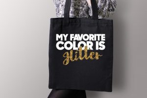
Fails like this can be found in many places. Many end up being NSFW fails that we’re not going to mention here, but others are less outrageous. For instance, an establishment called Fast Tacos where the “s” in Fast is too stylized and looks more like the letter r? Combine it with the odd-looking shape above the words and you have something that I’m sure the owners didn’t intend others to see in their name.
 How about a very famous brand making such an error? In an ad for Chanel, the tagline “I love Coco” is written out in a font meant to resemble handwriting. However, the tagline looks more like the brand is professing their love for cattle (which we can understand… cows are cute).
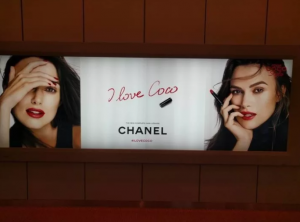
This is all meant to be light-hearted, but the issue is a serious one for businesses. In today’s digital age and where everyone has a camera in their hand, any font fails like this will live forever online. While some are harmless (because we all love cows), others can be much more damaging (such as your favorite color being Hitler). So, today’s design lesson is simple: Feedback is your friend. Your project should always be proofed by more than one set of eyes to prevent problems like those listed above.
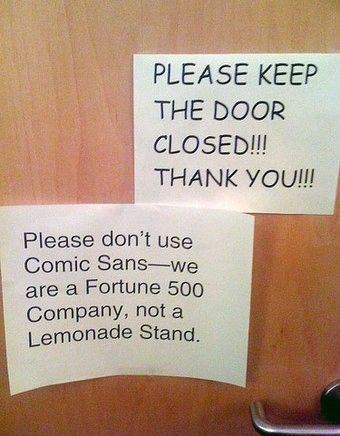
As a bonus, enjoy this image and remember: If you want your request to be taken seriously, please don’t use Comic Sans…